
The Graph panel allows you to create graphs from data stored in Table or Spreadsheet panels. You can choose from different graph types and apply curve fits to visualise your data.
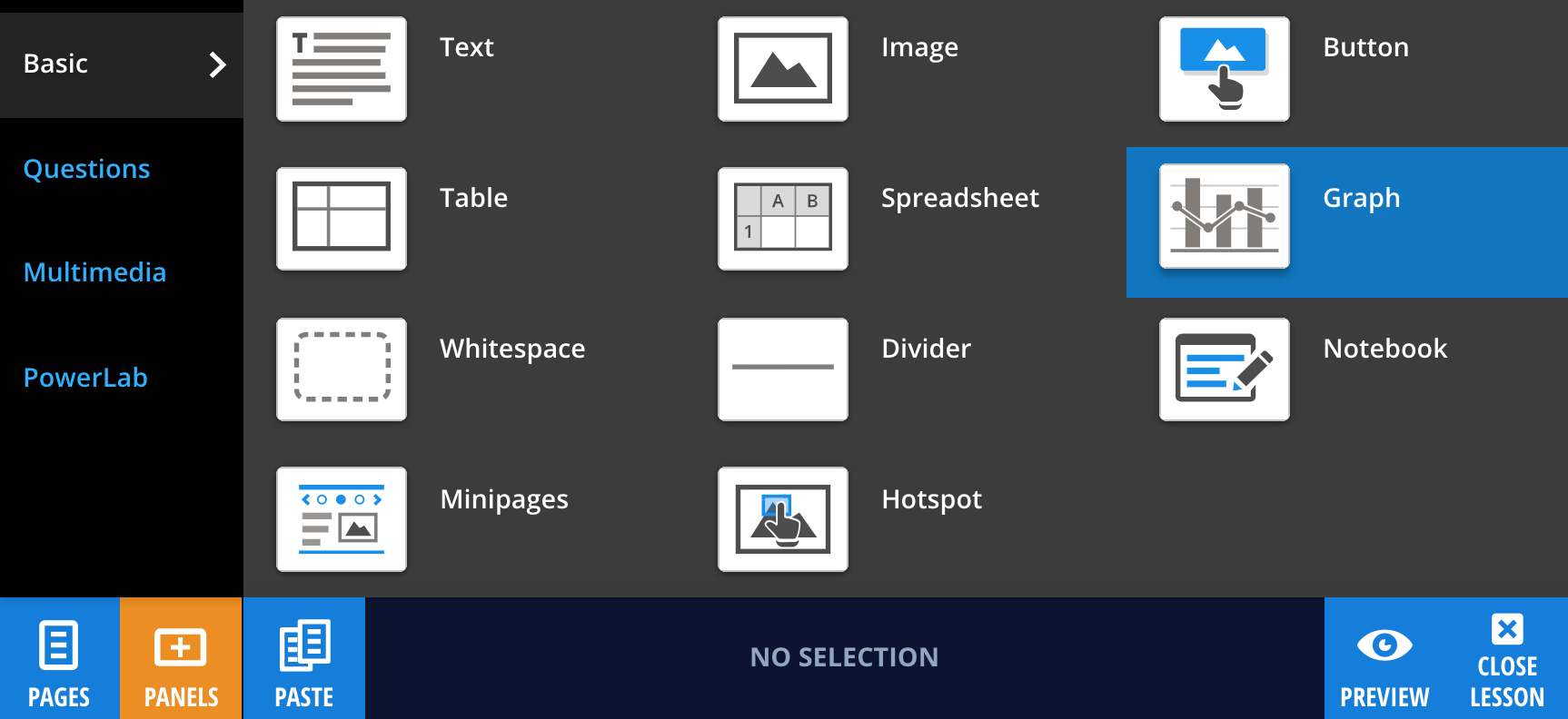
To add a Graph panel, select Panels from the footer, then choose Basic from the Panels menu. Drag and drop the Graph panel onto your lesson page.
Creating your graph
After placing the Graph panel, select it and choose Select Data, then select the Table or Spreadsheet panel you want to link to.
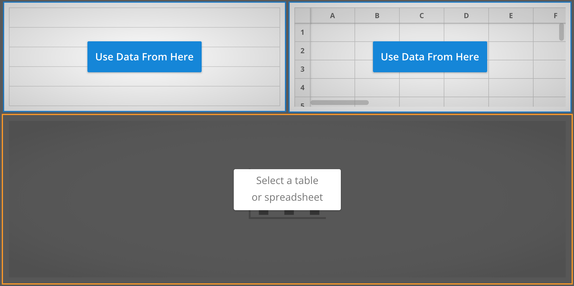
Note: A Graph panel requires a Table or Spreadsheet panel on the same page. When linked, a dashed border will appear around the selected data source. Graph panels can also be linked to Table Question and Spreadsheet Question panels.
To change the data source, select the Select Data icon next to the panel edit button  .
.
To configure your graph, select Edit, then Edit Graph.
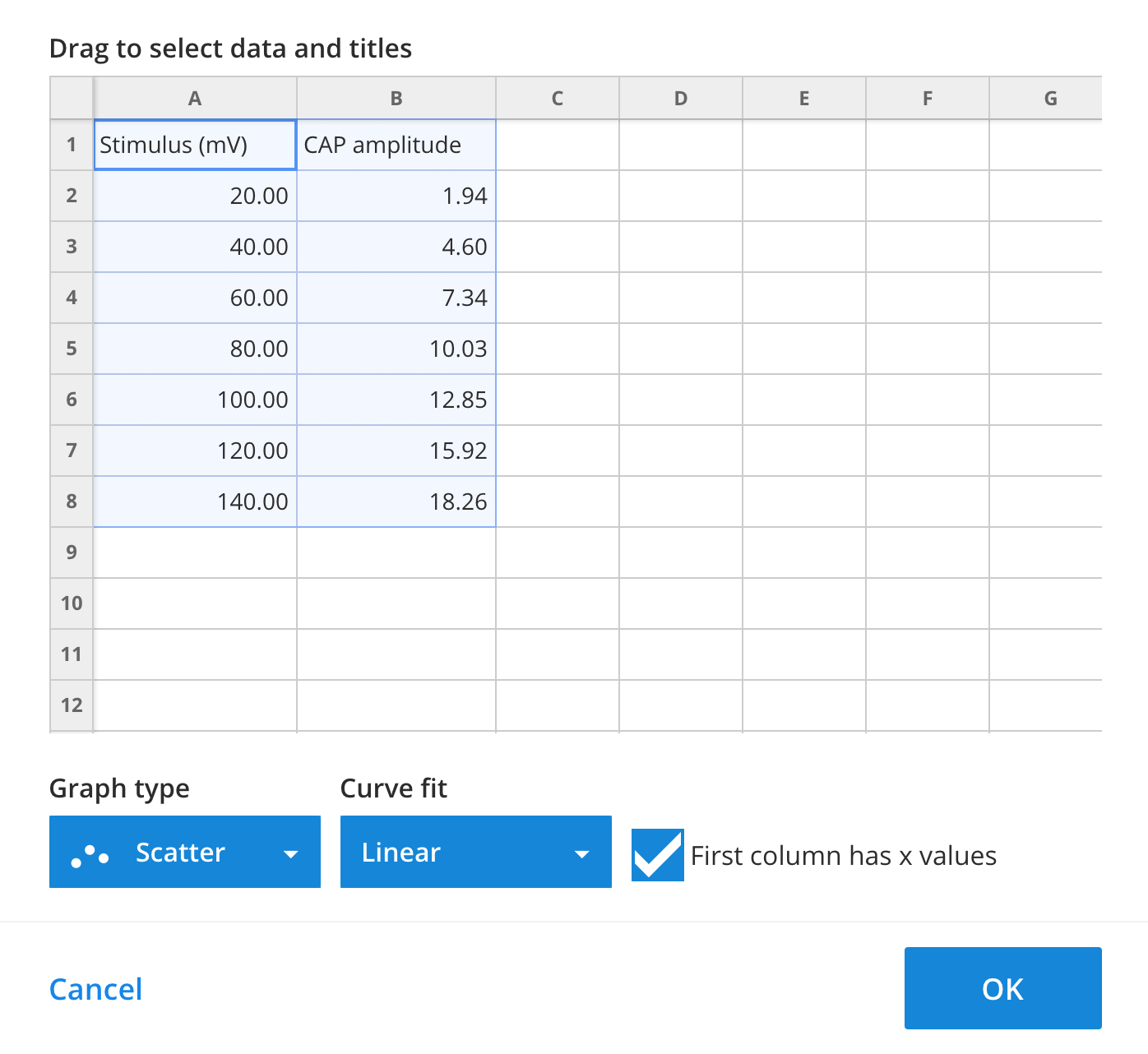
In the graph editor, drag to select the cells you want to include. You can also select entire rows or columns by clicking their headers.
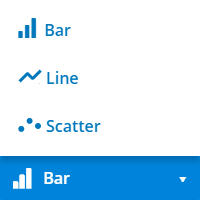
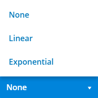
Choose a graph type: Bar, Line, or Scatter. You can also apply a Linear or Exponential curve fit to your data.
Select OK to generate the graph. If the linked panel contains data, the graph will appear automatically.
Customising your graph
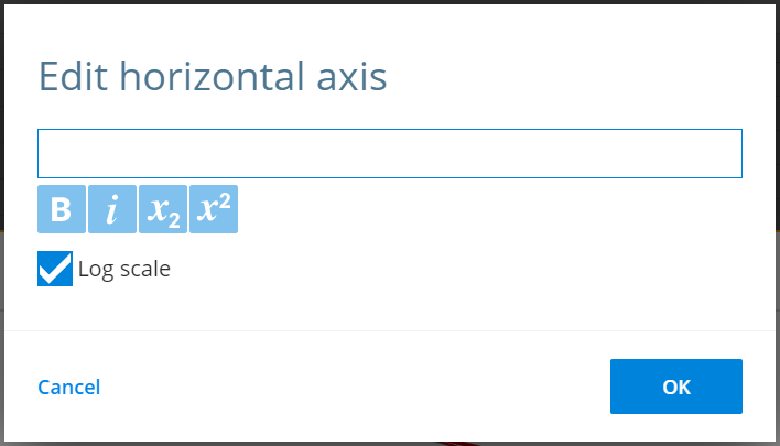
To edit the title or axis labels, select the pencil icon next to the label. Enter your changes and select OK to apply them.
Curve fit equations are displayed beneath the x-axis label.
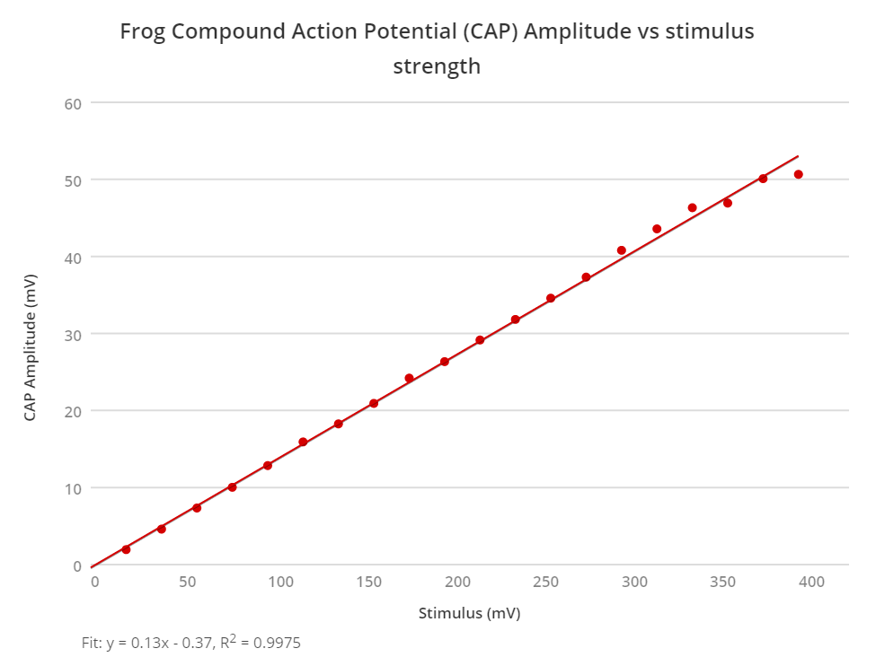
For Line and Scatter graphs, you can enable a Log scale on either axis. This is useful when working with data that spans a large range of values.